Wednesday, December 17, 2014

Sand Sculptures

These are a few really amazing sand sculptures I found. I thought that they were extremely cool and interesting, so I wanted to share them.

Sand Sculptures Photos 7

Sand Sculptures Photos 4

Sand Sculptures Photos 2 

Sand Sculptures Photos 1

Cinnamon Project


For this piece, I was inspired by the short story "Cinnamon" by Neil Gaiman. The character that stood out to me the most in the story was the parrot, so I decided to focus my work on it. I first drew a parrot and then scanned the drawing onto my computer. I then used Photoshop to color in the parrot drawing and to emphasize the bright colors that are often associated with parrots. The coloring took up the bulk of my time since it was a tedious job to color in the lines with the computer mouse. I wanted to incorporate a quote from the story, but the quote was too long to fit on the canvas. I decided to use the title of the story instead. I thought that just the parrot and title was too plain of an image, so I used a pixelate filter and then changed the square pixels into circular ones. I thought the end result looked like a cross stitch pattern, which I feel fits in well with the story. Overall I am very satisfied with the end result of my project and I am glad that I got opportunity to learn new skills with the Photoshop software.

Friday, December 12, 2014

Hand Paintings


I found these pictures of hands that were painted like animals. I thought they were really cool and detailed. I really liked how the wrinkles in the hand and the nails were worked into the drawings.

Monday, December 8, 2014

Artsy Grocery List


This is a grocery list I found online where someone drew out their list with pen instead of listing the items they needed. As my friend Michelle put it, "this is very hipster."

Friday, December 5, 2014

Linoleum Stamp Prints


I used the stamp I made a few weeks ago to make this project. I had to paint the stamp before each print and some of the prints didn't come out too well because the stamp kept bending. Other than that, I think this project turned out pretty well.

Wednesday, December 3, 2014

Fine Art Night Poster Edit


I was unsatisfied with the original version of this poster, so I decided to go back and edit it. I moved the text around and adjusted the font to make the words easier to read. I am much happier with this version of the poster.

Monday, December 1, 2014

Fine Art Night Poster


This is the poster I created on Adobe Illustrator for the Shades Valley/JCIB/SVTA Fine Art Night. I wanted to represent all of the fine arts in my poster since all of them will be featured during the Fine Art Night, so I did so by adding ornaments to the tree. For me, the most difficult part of this project was creating the images. Since I could not get images from the internet, I had to meticulously create each part of the design on Illustrator. Towards the end of the project I ran out of time, so if I were able to go back and edit this poster I would shift things around so that the text on the bottom left corner would not be squished together. Other than that, I am proud of the poster I created and am happy that I got to familiarize myself more with Illustrator.

Cereal Box


This is the cereal box I recreated on Adobe Illustrator. The original box is on the right and my recreation is on the left. I had difficulty recreating the cereal pieces in the mouth and I wasn't sure whether to add the dents and faded coloring from the box onto my recreation, but other than that I thought that this project was fairly simple and it really helped me become more accustomed to Illustrator.

Friday, November 14, 2014

Mickey Mouse


This is a picture of Mickey Mouse I randomly doodled. I thought it was pretty good for a free hand sketch that was drawn from memory.

Mehndi Design


The hand above has been adorned with mehndi. Mehndi is more commonly known as henna and is a paste that is applied to the hands and in pretty designs that resemble zentangles. Mehndi is most commonly worn by Indian women during special occasions. Doing the designs is a lot more difficult than it seems. I found that the hardest part about applying the designs is keeping your hand steady.

Linoleum Block Carving

This is the linoleum block I have been working on for the past few weeks. I started by drawing my pattern on the block and then coloring the parts I wouldn't scrape out. I just finished carving uncolored parts of the block with the the carving tool beside the block. Carving was the most difficult part of this project because it was tedious and I kept cutting myself with the sharp end of the carving tool. Now that I am finished carving, I am going to start making my prints and then I will be done!


Linoleum Block Coloring


This is a linoleum block that I will be using when making my prints. I drew the design on the block and am in the process of coloring. I am coloring the parts of the stamp that will catch the paint and won't be carved, so I will know which parts to carve out. Once I finish coloring I will start carving with the tools.

Friday, October 31, 2014

Hands


 In my art class last year one of my assignments was to make a sketch of five hands in different positions. I had never really drawn detailed hands before, so that task was somewhat challenging. On the first hand, I colored in the fingernails because I thought that the drawing may look better that way, but I found that the colored in fingernails looked weird. Since I didn't like the colored finger nails, I kept the nails in the four other sketches white.

Collage

In my Visual Arts class I was required to make a collage. I decided to try drawing one instead of using magazine pictures because I wanted to try something different. The collage is supposed to be a mixed-media collage, or a collage that incorporates many different materials. After I make the collage I am going to use paint and pastel to add detailing. So far, I have finished drawing and coloring the collage and will add more to it next time I am in class. I have a picture of the drawn collage below.


Friday, October 24, 2014

Indian Inspired Designs

This week in my art class we have started making linoleum stamps. The first part of the project is to create a design to go on the stamp and since my teacher had recently visited India, she requested that the design reflect the Indian culture. The cultural aspect was very easy for me to portray in my sketches for the design. I am not sure which design I am going to use for the stamp yet, but I will have to choose next week before drawing the design onto the linoleum block. I have the pencil sketches of the two designs below. I traced some of the figures in sharpie to make it easier for me to work around them when creating the abstract patterns in the background.


Cereal Box

This past week in my graphic arts class we have been looking at old cereal boxes to recreate as vector images using Adobe Illustrator. I chose a box of Alpha-Bits cereal because I thought it was interesting and it contained many geometric shapes. I have just begun the process of recreating the cereal box and have posted a picture of the original below.


Friday, October 17, 2014

Ninja Song

Last year I had the assignment of writing a song. After suffering from severe writer's block for days, I finally managed to create a song in the middle of the night. I quickly wrote the lyrics down and even drew little pictures around it that described the events of the song. I like to call this masterpiece my pride and joy. I have a picture of it below.


Op-Art Cube

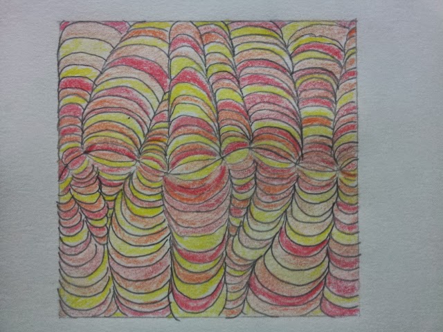
 A few weeks ago I posted pictures of Op-Art, or Optical Art, that I had drawn and colored. I used those pictures as practice for one of my assignments from my Visual Arts class. The assignment was to use various color schemes to create a cube with different Op-Art patterns on each of the six sides. To complete the assignment, I had to first cut out an outline of a cube on paper so I could fold it later. I drew my patterns on each face of the cube in pencil, traced the pencil with sharpie, and then colored the cube with colored pencils. Lastly, I folded the cube and used hot glue to attache the faces. I took the pictures that I have posted while the glue was still drying, so the faces are not completely attached yet. Even though the coloring was tedious, I enjoyed this assignment and am glad that I got the opportunity to learn about a new art technique.


Friday, October 10, 2014

What is 17?

 
This is a poster that I made a year ago and submitted it to a Public Service Announcement competition. I used Microsoft Word to make the poster and various websites to research. I got the idea to make this poster when I noticed that many of the statistics for drunk driving involved the number 17. I ended up winning a special prize called the Carter Zwack Prize and $200 as prize money.

Thursday, October 9, 2014

Geometric Self Portrait

   For this assignment I used Adobe Illustrator. Illustrator is a lot different from Photoshop, which is the software I know the best, so using Illustrator was a fun learning experience. One of the main differences between Illustrator and Photoshop is that Photoshop deals with raster images and Illustrator deals with vector images. A raster image is made up of small, equally sized pixels. A vector image is made of shapes that are connected together by vectors. The original image of me was a raster image and by using Illustrator I made it into a vector image. Another major difference between the two programs is that Illustrator can be used to create images from scratch while a preexisting image is required in Photoshop.


   To create the image above, I mainly used the pen tool and the eye dropper tool. The pen tool allowed me to create shapes on my face and the eye dropper tool filled in the shapes with the most abundant color inside the shape, which was mostly different shapes of brown. In order to use the eye dropper tool I also had to use the selection tool to select the shapes I wanted to fill in.
   My favorite part of this assignment was the end result. I thought that all of different shapes and colors made a really cool image. My least favorite part about this assignment was how tedious the process was. Making the shapes was a meticulous process that took a while to do correctly. If I was given this assignment again, I would improve it by going at a faster rate. Now that I know exactly how to complete this assignment, I would be able to add more detail and take less time to complete it.

Friday, October 3, 2014

Op Art


These are the two pieces of Op Art, or Optical Art, that I made a few weeks ago. To make these, I first drew the patterns and then colored them with color pencils.

Jack the Dripper

Jackson Pollock was an American Painter who started the abstract expressionist movement. He is most famous for the splatter paint artwork he made by splattering paint on a canvas using paintbrushes and adding texture with knifes. His paintings became so famous that he got the nickname Jack the Dripper. Pictured below is one of his murals where he used the splattering method.

Friday, September 26, 2014

Shells


    When I visited a beach in India, I bought some shells from a street vendor and he etched my name and some birds onto it. I thought the amount of skill it took to make something as intricate as the birds on the branch (as pictured above) was astounding and the part that amazed me even more was how fast he made it. Another time I visited a beach I got another shell (picture below) but the vendor painted my name and the birds instead. Again, I was surprised at the speed of his painting. I can't wait to get another shell when I go back to India!


Pastel Self-Portrait


    This is a self-portrait I made last year. I first sketched it based on a picture of myself when I was younger. I then used oil and dry pastels to add color. Since I used warm colors on my skin, I used cool colors in the background to add contrast. This is one of my favorite pieces and I hope I'm just as proud of my next self-portrait as I am of this one!

Friday, September 19, 2014

"Punny" Street Art

A popular street artist who goes by the name JPS has skillfully painted popular characters around the UK accompanied by "punny messages." Most of his pieces feature pop culture characters such as Loki, Yoda, and Spiderman. I have attached some of them below.


When I looked at these images, I saw the immense detail that was needed for each picture and really appreciated it. I also thought that the comedy aspect of these images made them all the more interesting and memorable.

Andy Warhol


    This week, I was watching the movie Men in Black 3 and I noticed that the main characters of the movie met and talked about a famous artist in the 1960s named Any Warhol. I wanted to know more about him so I decided to do some research. Warhol, who is pictured above, started the trend of pop art, or art focusing on mass-produced goods. One of his most famous pieces of pot art is of a Campbell Soup Can. He also painted Coca-Cola bottles, vacuum cleaners, hamburgers and celebrities. 
    Warhol expressed the idea of pop art in his famous quote, "Once you 'got' pop, you could never see a sign the same way again. And once you thought pop, you could never see America the same way again." His work is in stark contrast to the work of his predecessors who focused on different aspects such as abstract or impressionism. Warhol is considered one of the most influential artists of his time and has come to represent a the new form of art that has been cherished over the past 50 years.
"Campbell's Tomato Soup Can" by Andy Warhol

This picture of Marilyn Monroe is an example of Warhol's colorful portraits

Wednesday, September 17, 2014

Edited Influence Map


   After I posted my influence map, I went back and decided to edit it again. I started by changing the placement of my name so it would not be cut off by the top of the map. I then removed the writing at the bottom and changed the color of the background to a lighter gray. I also wanted the color change to highlight the words at the top (the title and my name).
   In my previous post I did not mention why I chose each picture and I want to take the time to do that now. I chose the top left picture because I enjoy making movies and a lot of my art is inspired by things that I have made movies on or seen in movies. The picture below it is of a cat with the words "Hang in There." I chose this picture because it is motivational and I get frustrated a lot when I make art or do anything requiring a lot of focus, so this picture will remind to just "hang in there." The picture next to it is of children around the world. Helping people and volunteering shows all the good in the world, which inspires me in not only my art, but also my life. Beside the picture of the globe with children, I have a picture of Kim Possible, the main character of my favorite show as a child. Kim Possible was one of the first people I drew when I was younger and still inspires me to draw things I love. To the right of the Kim Possible picture, I have a picture of the words "Don't Stop Believing." Don't Stop Believing is one of my favorite songs and I think it has a good message. It doesn't directly inspire my art, but listening to the song is one of the factors that contributes to my art. Continuing with the music theme, underneath the picture of Kim Possible I have the name of the band AC/DC. I listen to a lot of rock music when I draw which helps me focus, and AC/DC is my favorite band out of all the rock bands I listen to. The smiley face next to the AC/DC picture is the logo of my favorite app, iFunny. Whenever I do anything I tend to get distracted a lot and when I do I usually get on iFunny. Now, getting distracted on iFunny has become an integral part of my work and it would feel odd to leave it out of my daily schedule. Below the iFunny picture, I have a picture of the Justice League, a group of superheroes from comic books. The art in comic books are very inspirational to me because of how amazing the quality of each picture is even though the artist has a minimal amount of time for them. On the bottom right corner I placed a picture of an astronaut sloth. The picture represents my love of funny art. I like drawing things that are odd and amusing more than conventional objects. Lastly, the twitter quote from Jaden Smith on the top right corner doesn't exactly inspire me, but it shows a difference in opinion. Jaden Smith thinks his quote is extremely philosophical and that he's the next Plato, but the rest of the world knows that he is just an idiot. Jaden Smith keeps posting tweets even though he knows people are laughing at him, and his confidence in his work can also be interpreted into art. The most important thing is to have confidence in your own work no matter what anyone else says and I hope my influence map shows that.

Influence Map


When I was making my influence map, I wasn't sure where to start, so I began by picking out my pictures. I had a difficult time thinking of what to put on the influence map, but then I decided on putting pictures of things that not only inspired me, but things I like and that make me smile. After I got my pictures, I needed a way to organize them. I tried making them into collage, but I didn't like how messy it looked so I decided to organize them into the grid. Lastly, I added my name to the top of the blog to show that it was my influence map.